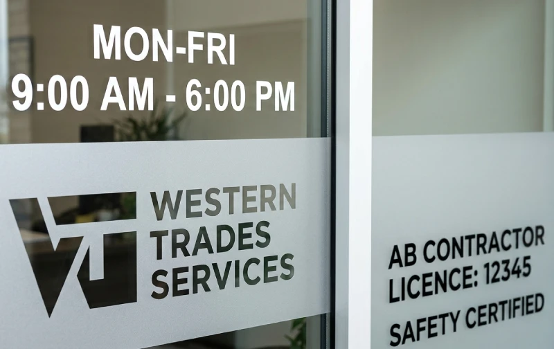
The business door is the last thing a customer sees on the way in and the first thing they see on the way out. It is a small surface with a significant communication role: it confirms that this is the right place, communicates when the business is open, and in some cases displays legally required information about the business and the people who operate it.
Most businesses underuse this surface. A paper printout of hours in a plastic sleeve. A logo decal applied at an angle. A handwritten note about holiday closures still taped to the glass in February. These provisional solutions communicate something about the business that their owners almost certainly don’t intend: that the details don’t get full attention.
A professional door and window lettering package is not expensive. Applied correctly by an experienced installer, quality vinyl lettering on a business door lasts five to seven years, costs significantly less than most other sign types, and communicates permanence, precision, and professionalism every time a customer approaches. This guide covers what belongs on a business door, what materials to use, what legal requirements apply in Alberta, and how to get it right.
What Belongs on a Business Door: The Standard Information Set
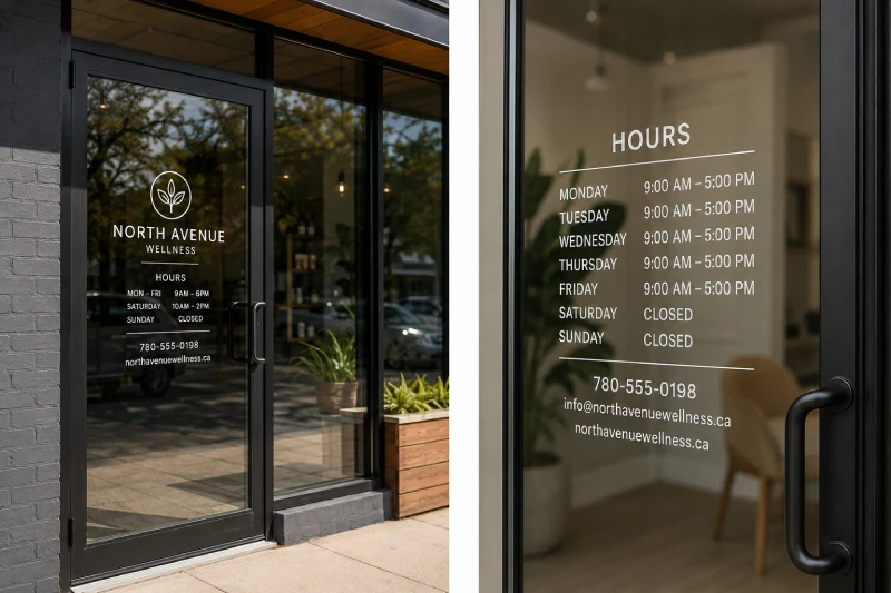
The minimum information set for any commercial business door is: hours of operation, a contact phone number, and a business name or logo if the building-mounted sign is not directly visible from the door approach. These three elements give a customer everything they need before entering: confirmation of the business, confirmation that it is open, and a way to reach someone if it is not.
Beyond the minimum, a well-considered door lettering package might include the website address, a secondary contact (email or social handle for customer service), and any regulatory information required by the business type. Emergency contact information is appropriate on the door or a window immediately adjacent to it.
The hierarchy of this information should be reflected in the visual sizing. Business name or logo: largest. Hours: clearly readable at door approach distance (2 to 3 metres). Contact number: same scale as hours or slightly smaller. Website and secondary information: smallest, supplementary. Every element at the same size competes with every other element; clear visual hierarchy makes the information usable at a glance.
Legally Required Information on Business Doors in Alberta
The specific information that Alberta law requires businesses to display varies by business type and regulatory authority. Rather than a comprehensive catalogue (which would require a legal reference, not a sign guide), here are the categories most commonly relevant to businesses considering door lettering:
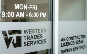
Regulated trades governed by Alberta’s Skilled Trades and Apprenticeship Education Act are required to display their contractor licence number on business premises. This number must be visible and accessible; many trades businesses include it on the door or window lettering alongside hours and contact information. The licence number is also typically required on business vehicles, which connects to the vehicle graphics discussion.
Liquor-licensed establishments are required under Alberta Gaming, Liquor and Cannabis (AGLC) regulations to display their liquor licence and its conditions at the licensed premises. The specific placement requirements are set by AGLC and should be confirmed with the authority before designing window lettering for a licensed venue.
Health-regulated facilities are typically required to display the registration or licence number of the regulated professional at the practice entrance. Professional colleges set these requirements; confirm with your specific college before designing door graphics.
Business licences issued by municipalities (Edmonton, St. Albert, Spruce Grove, and others) are typically required to be kept on premises and available for inspection, but municipalities differ on whether they must be visibly displayed in a window or door. Confirm with your municipality’s business licence office.
Materials for Door and Window Lettering: Vinyl, Frosted Film and Beyond
Cut vinyl lettering is the standard material for business door and window information. Cast vinyl in outdoor-rated grades adheres cleanly to glass, holds color without fading for five to seven years in exterior applications, and removes cleanly at the end of the lease with appropriate technique. Colors are available across the full spectrum, and the material can be applied as cut letters (no background, the glass shows through) or as a solid-backed panel for applications where a background color is needed.
Frosted or etched-look vinyl is the material choice when aesthetics matter as much as information. A frosted vinyl application on a glass door panel looks permanent and architectural in a way that standard cut vinyl does not. It is particularly appropriate for professional services (legal, financial, medical, consulting), premium retail, and any business where the door is a significant part of the client experience. Frosted vinyl is available in solid translucent (allows light through but obscures the view), semi-transparent patterns, and custom designs.
Gold or silver vinyl lettering creates a gilded-glass appearance appropriate for businesses where a heritage or prestige aesthetic is appropriate. Law firms, financial advisory practices, and established professional services offices often use gold vinyl lettering for the door as a deliberate choice to reference traditional professional signage while using a contemporary material. Applied correctly, gold vinyl is indistinguishable at a glance from real gold leaf on glass.
For exterior door applications, the vinyl should be specified as an outdoor-grade cast vinyl with UV laminate. Interior window applications can use a lighter-weight film, but exterior applications need the UV stability and weather resistance of outdoor-grade material.
Design Principles: Readable, Legible and Proportional
Three principles govern effective door lettering design: readability at the relevant distance, visual hierarchy that prioritizes information by importance, and proportionality to the glass surface being lettered.
Readability at distance means sizing information for how it will actually be read. Hours and phone numbers on a door are typically read from one to two metres away, standing in front of the door, deciding whether to enter. At that distance, text as small as 12 millimetres cap height is readable by a person with normal vision in good lighting. However, for hours that are frequently read by people approaching from further away or in lower light (early morning, evening), 20 to 25 millimetres cap height is more practical. Business name and logo elements should be significantly larger, sized for readability from the street or parking area.
Visual hierarchy means that not everything should be the same size. A door lettering layout where hours, business name, phone number, and website are all set in the same type size reads as a block of text rather than as organized information. The correct approach: business name or logo at maximum scale, hours and phone number at comfortable reading size, secondary information at a smaller supporting size. Three tiers of information hierarchy are typically sufficient.
Proportionality means that the lettering should fit the glass surface without either overwhelming it or looking undersized. A standard commercial door panel is approximately 600 millimetres wide and 1,500 millimetres tall in the glass area. Lettering centered on this surface, with appropriate margins, looks intentional. Lettering that is too large crowds the glass; lettering that is too small looks like a provisional afterthought in the middle of a large clear surface.
Application Tips and Longevity: Interior vs. Exterior Application
The choice of interior versus exterior application affects both appearance and longevity.
Exterior application produces the sharpest, most visually crisp result. The lettering reads directly as a surface on the glass, with no visual softening from the glass thickness. It is exposed to weather, which means UV laminate is essential for outdoor-rated durability. Exterior application is standard for logos and primary business name elements where visual impact is the priority.
Interior application is protected from weather and physical contact (less vulnerable to being scratched or picked at by passersby). It is slightly softer in appearance viewed from outside, because you are looking at the lettering through the glass layer, but the difference is only noticeable on close inspection. Interior application is appropriate for hours, phone numbers, legal information, and other text elements where longevity and protection are more important than maximum visual crispness.
The professional standard for a complete door lettering package is typically mixed: logo and business name on the exterior glass for maximum impact, hours and contact information on the interior for durability and protection. This approach gives you the best of both: a crisp, visible brand presence that also functions as a durable information display.
FAQ
- What information is legally required on a business door in Alberta? – Requirements vary by business type. Most businesses should display hours of operation and a contact number as standard practice. Regulated trades (electricians, plumbers, gas fitters) must display their Alberta contractor licence number on business premises. Liquor-licensed establishments must display their AGLC licence under provincial regulation. Health-regulated professionals (dental, pharmacy, optometry) must display their professional registration as required by their college. Business licence display requirements vary by municipality. Confirm the specific requirements for your business category with the relevant regulatory authority.
- How long does vinyl lettering last on a business door? – Exterior-grade cut vinyl lettering on a business door typically lasts five to seven years before it begins to fade, lift at edges, or lose adhesion in Alberta’s outdoor conditions. Interior-applied vinyl, protected from UV and weather, lasts significantly longer, often the full term of a commercial tenancy. Quality matters: premium cast vinyl films (3M or Avery Dennison outdoor-grade) significantly outperform economy alternatives that may begin to fail within two to three years.
- Can business door lettering be removed without damaging the glass? – Yes. Professionally applied vinyl lettering is designed for clean removal when the time comes. Using heat and the correct removal technique, quality vinyl releases from glass cleanly without adhesive residue in most cases. This makes door lettering a practical choice for leased commercial spaces where the tenant is responsible for restoring the premises. Avoid leaving vinyl on glass for more than eight to ten years, as very long-term adhesion becomes progressively harder to remove cleanly.
- What font should I use for business hours on a door? – Use a clean, bold, sans-serif typeface for hours and contact information, like Arial, Helvetica, Gill Sans, or the sans-serif component of your brand’s typeface system if it is readable at small sizes. Avoid decorative, script, or ultra-thin typefaces for informational text: hours and phone numbers need to be legible in a few seconds in variable lighting conditions. Minimum practical letter height for door hours is 18 to 20 millimetres for comfortable reading at door-approach distance.
- Should door lettering be applied inside or outside the glass? – The professional standard is mixed application: logo and business name on the exterior glass for maximum visual crispness, hours and contact information on the interior surface for durability and weather protection. Exterior application produces the sharpest visual result; interior application is more durable and protected. Applying the brand identity elements to the exterior, where visual impact is the priority, and the operational information to the interior, where protection matters, gives you the best outcome from both surfaces.